Nov 12, 2023
Increasing this blog's readability
In the last few weeks, I have gradually tried to improve this website's readability and efficiency.
Domain
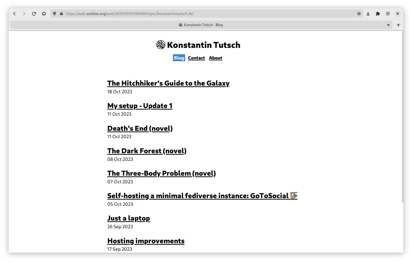
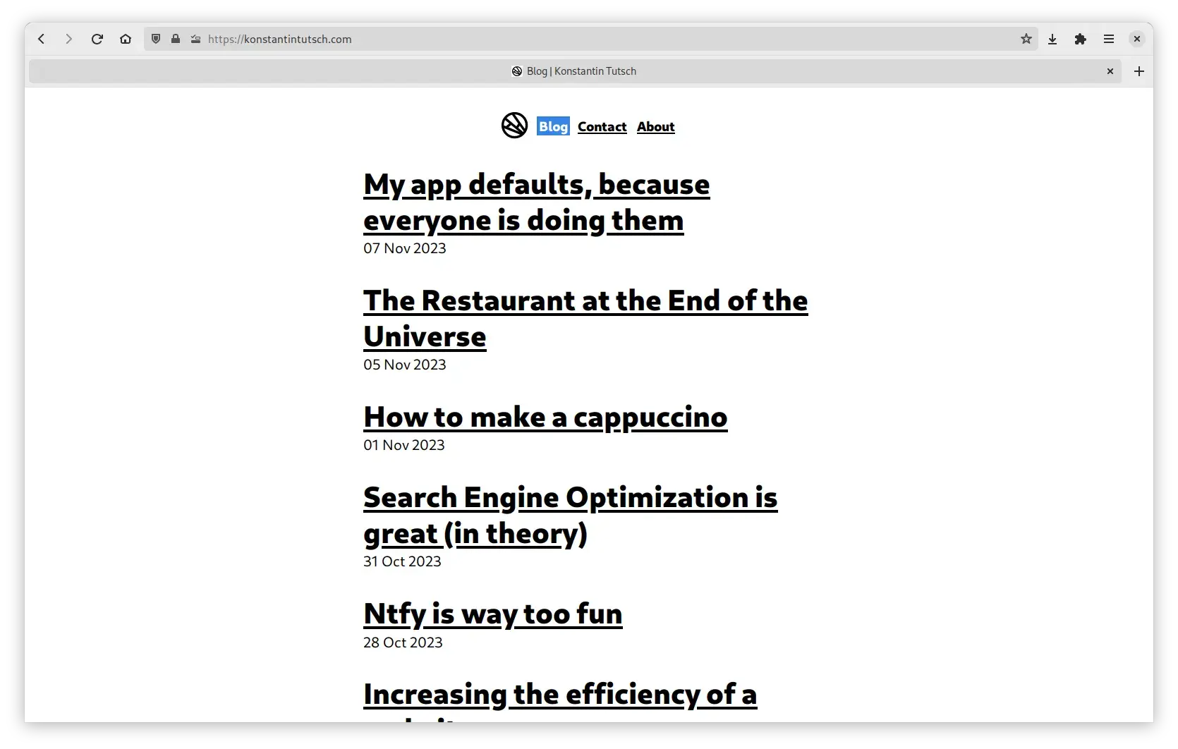
The most noticiable revision is probably that I moved this website to a new domain. The site's domain now is konstantintutsch.com instead of the old konstantintutsch.de.
I mainly changed the domain because .com suits this site better. I don't write german content here, so using the german TLD didn't really fit except that I'm from Germany.
Style
But I did not only chose a different domain, I also changed multiple elements of this site.
Header
First, I decided to get rid of the big heading with my name. This change adds a bit more to the website's simplicity.


Additionally, as you can see on the second image, the title's sizes increased.
Code
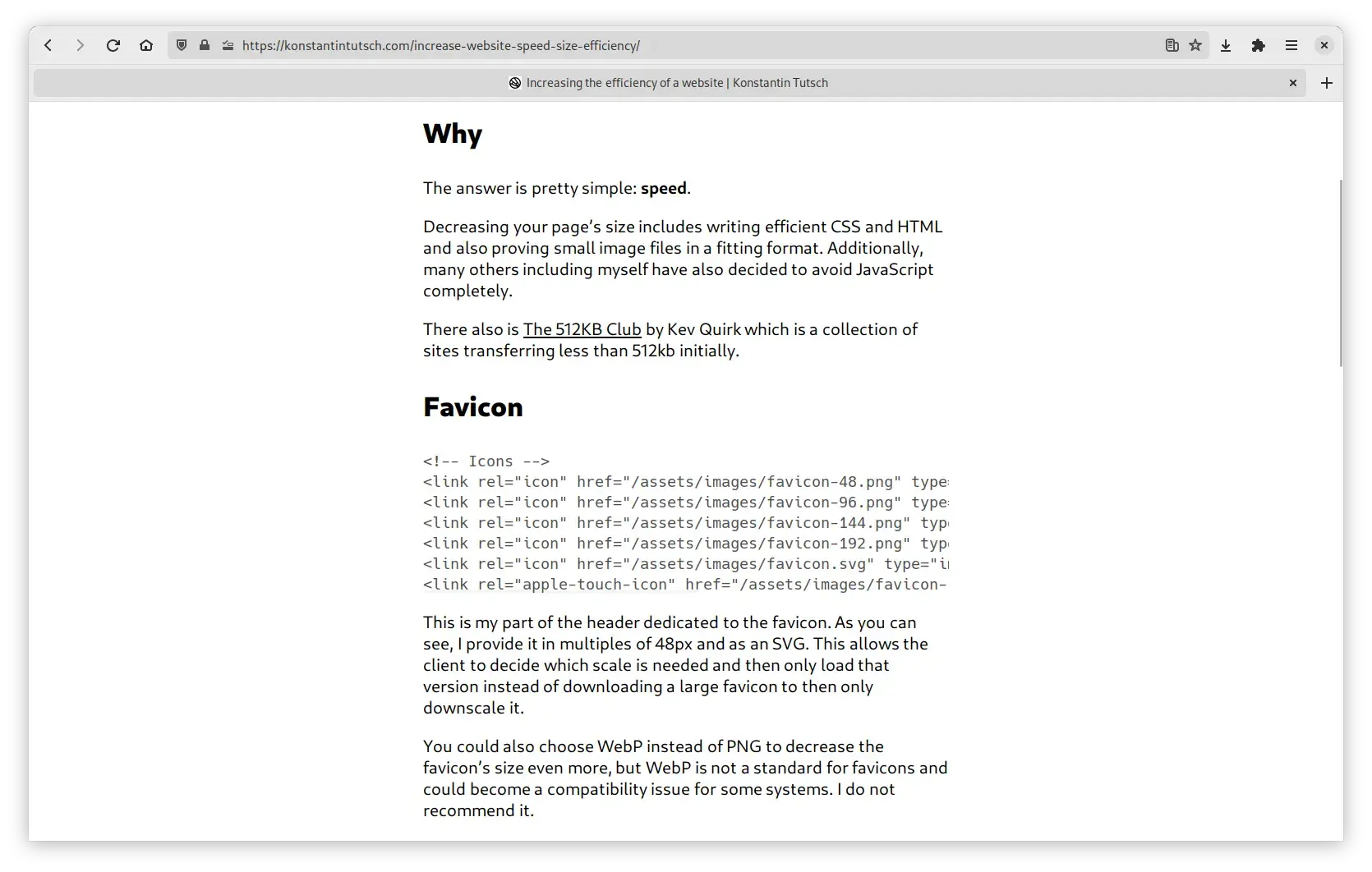
Furthermore, I decided to change the syle of code. I removed highlighting. This may sound horrible, but I can gurantee you it is not.
For the highlighting to work, a lot of CSS was necessary. All of that is gone now and simplicity has won again!

Inner workings
You probably guessed it, things changed. Here's a short list: